Visualizations
Voting Turnout and Eligibility Graphs
abortionvoting_df %>%
  drop_na() %>%
  ggplot(aes(x = state_abv)) +
    geom_point(aes(y = turnout_rate2018, colour = "2018")) +
    geom_point(aes(y = turnout_rate2022, colour = "2022")) +
  theme(axis.text.x = element_text(angle = 90, hjust = 1)) +
  labs(
    title = "Voting Turnout Rate in 2018 vs 2022",
    x = "State",
    y = "Rate Difference",
    caption = "Figure 1. Voting Turnout Rate in 2018 and 2022.")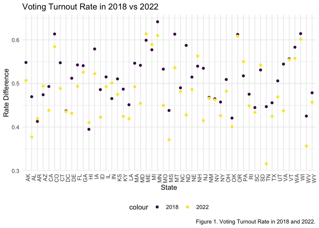
Figure 1 shows the voting turnout rate for all 50 states in 2018 and 2022. The data points for 2018 are purple, and the data points for 2022 are yellow. From the figure, it can be determined that generally, the voting turnout rate in 2018 was higher than the voting turnout rate in 2022.
abortionvoting_df %>%
  drop_na() %>%
  ggplot(aes(x = state_abv)) +
    geom_point(aes(y = turnout_estimate2018, colour = "2018")) +
    geom_point(aes(y = turnout_estimate2022, colour = "2022")) +
  theme(axis.text.x = element_text(angle = 90, hjust = 1)) +
  labs(
    title = "Turnout Estimate Number in 2018 vs 2022",
    x = "State",
    y = "Rate Difference",
    caption = "Figure 2. Turnout Estimate Number in 2018 and 2022.")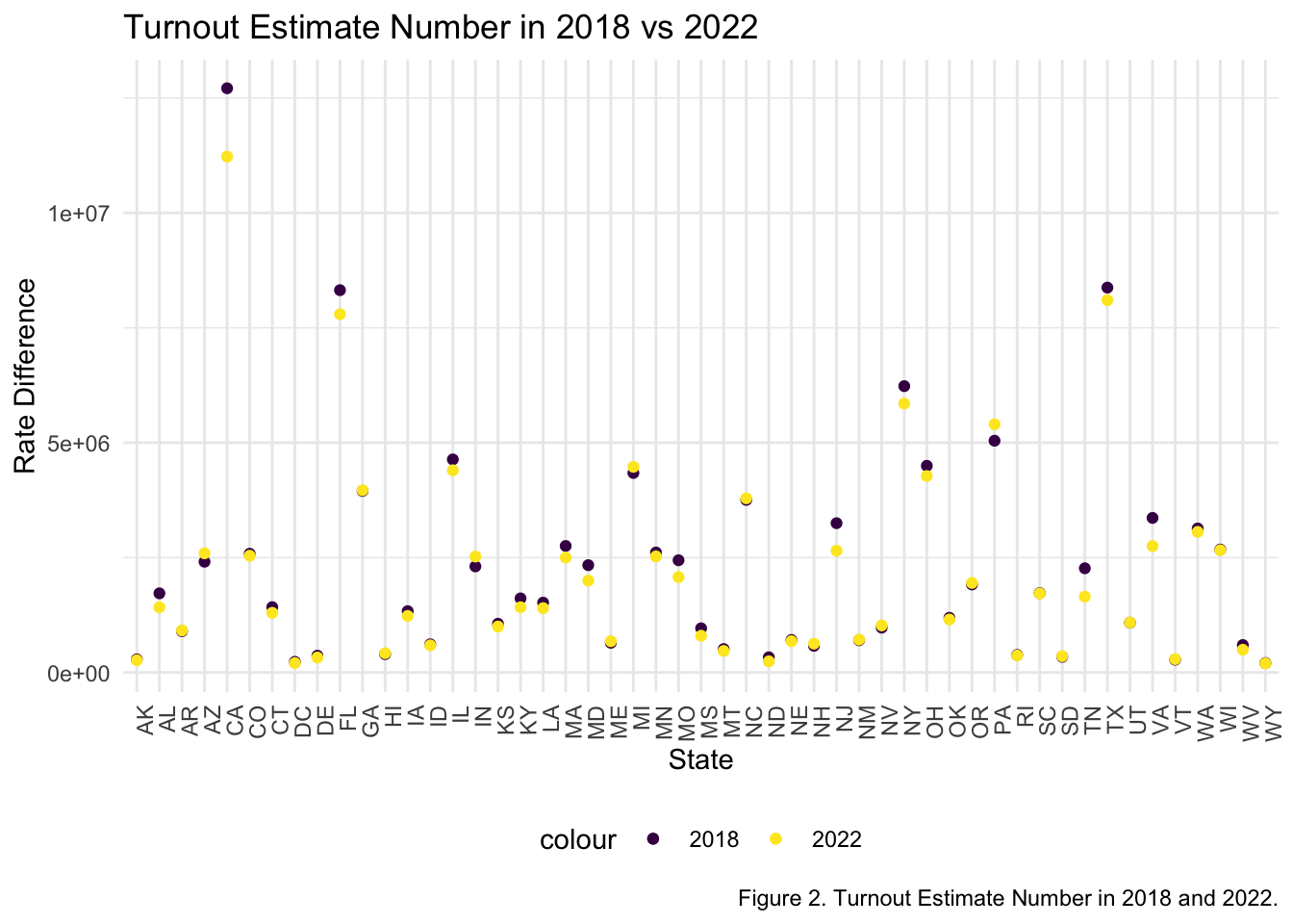
Figure 2 shows the turnout estimate number in 2018 and 2022. The estimate number for 2018 is purple and the estimate number for 2022 is yellow. From this figure, it can be determined that the estimates for voting turnout in 2022 is lower than those from 2018. When comparing this figure with the actual turnout rate (Figure 1), we see that the actual voting turnout is generally lower than the estimated voting turnout.
abortionvoting_df %>%
  drop_na() %>%
  ggplot(aes(x = state_abv)) +
    geom_point(aes(y = voting_eligible_pop2018, colour = "2018")) +
    geom_point(aes(y = voting_eligible_pop2022, colour = "2022")) +
  theme(axis.text.x = element_text(angle = 90, hjust = 1)) +
  labs(
    title = "Voting Eligibility Population in 2018 vs 2022",
    x = "State",
    y = "Population",
    caption = "Figure 3. Voting Eligibility Population in 2018 and 2022.")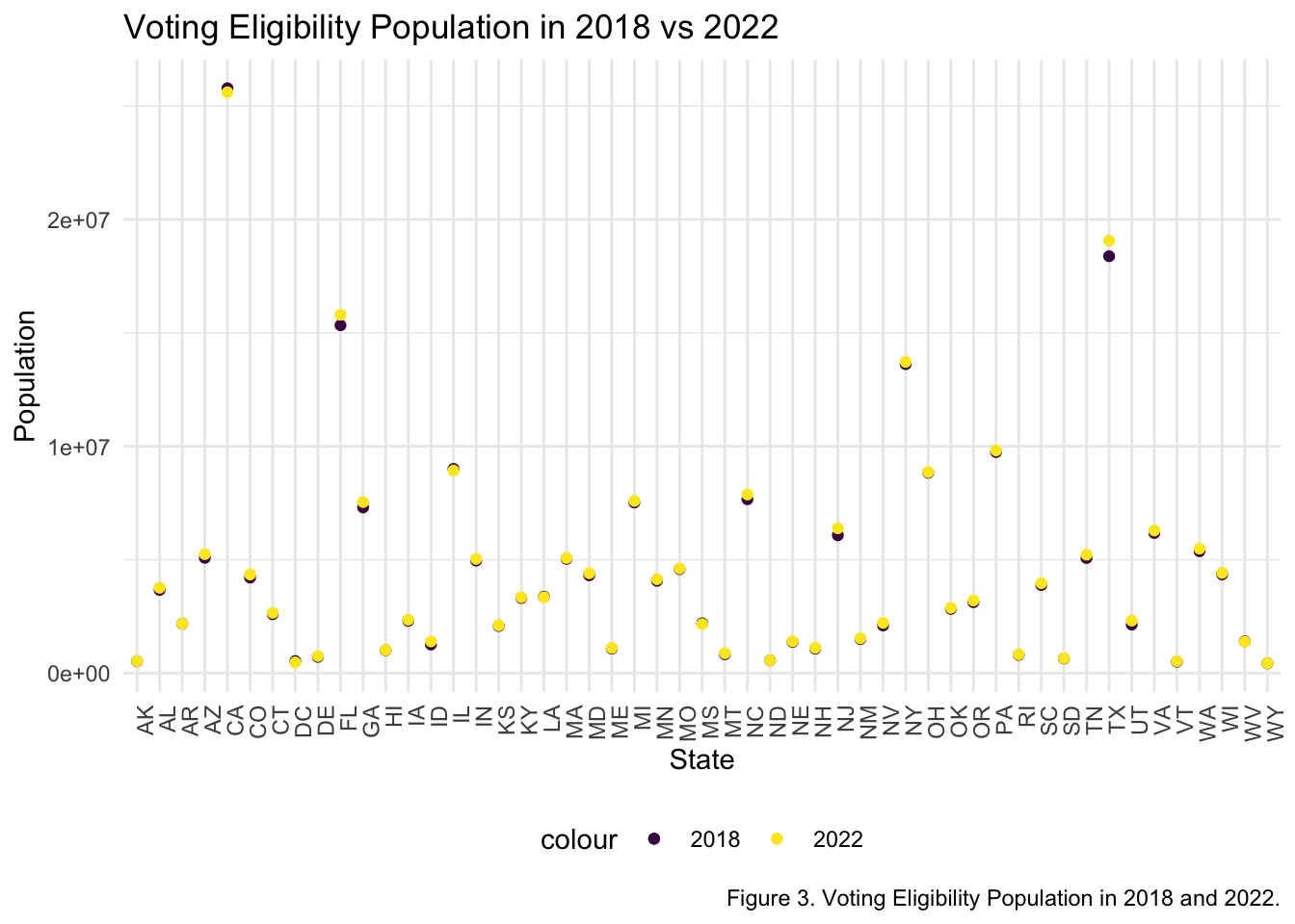
Figure 3 displays the population of people that were eligible for voting in 2018 and 2022. The data points for 2018 are purple and the data points for 2022 are yellow. From the figure, it can be seen that generally, more people are eligible to vote in 2022. Many points did not experience either an increase or a decrease in 2022 compared to 2018. External factors should be considered, especially from the information provided from Figures 1 and 2, where the voting turnout estimate and rate was lower in 2022.
abortionvoting_df %>%
  drop_na() %>%
  ggplot(aes(x = state_abv)) +
    geom_point(aes(y = voting_age_pop2018, colour = "2018")) +
    geom_point(aes(y = voting_age_pop2022, colour = "2022")) +
  theme(axis.text.x = element_text(angle = 90, hjust = 1)) +
  labs(
    title = "Voting Age Population in 2018 vs 2022",
    x = "State",
    y = "Difference",
    caption = "Figure 4. Voting Age Population in 2018 and 2022.")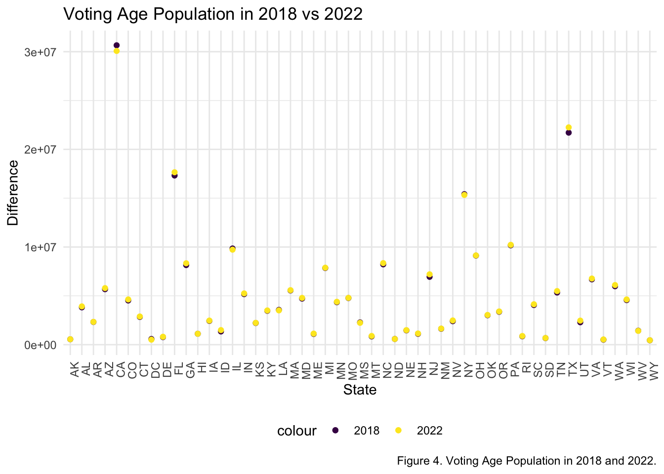
Figure 4 depicts the voting age population in 2018 and 2022. The data points for 2018 are purple and the data points for 2022 are yellow. From the figure, it can be seen that generally the voting age population in 2022 is higher than the voting age population in 2018.
Abortion Laws and Accessibility Graphs
abortionvoting_df %>%
  drop_na() %>%
  ggplot(aes(x = state_abv)) +
  geom_point(aes(y = clinicdistance_jun, colour = "June")) +
  geom_point(aes(y = clinicdistance_jul, colour = "July")) +
  theme(axis.text.x = element_text(angle = 90, hjust = 1)) +
  labs(
    title = "Distance to An Abortion Provider from June to July, 2022",
    x = "State",
    y = "Distance (Miles)",
    caption = "Figure 5. Average Distance from an Abortion Clinic from June to July after Overturn of Roe vs. Wade.")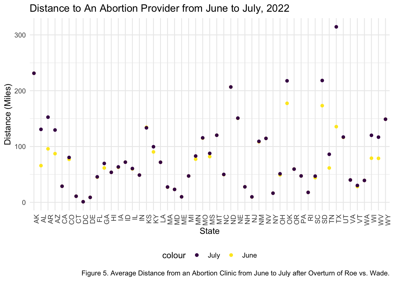
Figure 5 portrays the average distance from an abortion clinic in June and in July. The data points for the month of July are purple and the data points for the month of June are yellow. From this figure, we can see that the distance from an abortion clinic increases in July, compared to June. This is important to consider, especially with Roe vs. Wade being overturned in June. From this figure, the magnitude that policy has on institutions can be seen.
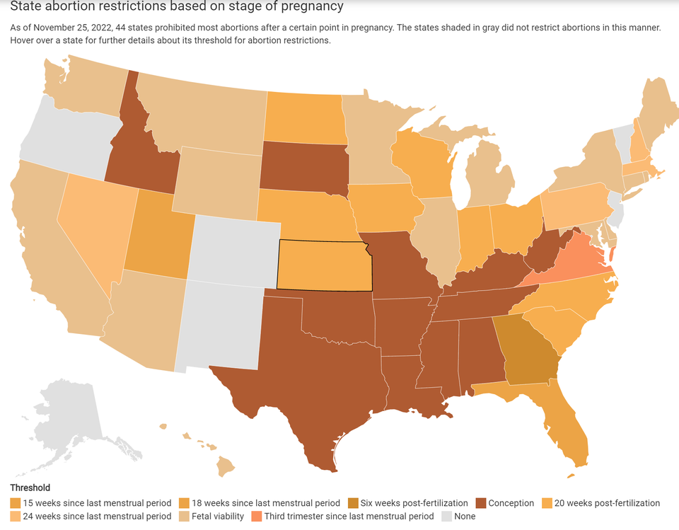
This figure from the Balletopedia dataset depicts state abortion restrictions based on the stage of pregnancy as of November 25, 2022. 44 states restricted abortions after a certain point in pregnancy, and 6 states including Washington D.C. did not implement any abortion restrictions. There are different thresholds on when abortion is restricted in the 44 states.
The definitions of the thresholds are explained below:
- Conception: prohibits all abortions, but abortion may be considered if the patient’s life is at risk.
- Fetal heartbeat: prohibits abortions after a fetal heartbeat can be detected; this may begin as soon as 6 weeks after the last menstrual period. Fetal viability: prohibits abortions and is interpreted by the Supreme Court at about 24-28 weeks into pregnancy.
- Last menstrual period: marks the beginning of a pregnancy from the first day of a woman’s last menstrual period (LMP).
- Post-fertilization: marks the beginning of conception, which can be up to 24 hours following intercourse.
- Post-implantation: marks the beginning of pregnancy and takes place when an egg attaches to the uterus; this is roughly five days after the egg is fertilized.
Source: Balletopedia.org